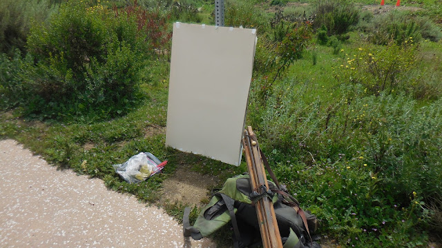
After the Rain. Mixed media painting pastel over water color
I decided to work on U-Art sanded paper 400 grit. It can handled the water color and has the tooth to handle the pastel.
After what seemed like the most rain I can remember since 2000, the plants were as green as I had ever seen them in this area. On the drive down I was thinking about how I wanted to attack the painting. From a technical standpoint, I had over stated the shape of the water in the past. I wanted to capture the reds and purples that I see between the brush. I wanted to increase the feeling of distance within the painting. I did not think I created enough atmospheric perspective in some of the paintings I have done in this location.
I used my large water color brush to create the shapes and design of the painting. I worked with color to indicate the distance. The dark greens in the foreground and the blues to indicate the receding shapes. I used a red wash where the grasses were going to be placed.
I left open paper around the shapes to allow for their development at the later stages in the painting. The blank paper represents the lighter values within the painting and around the shapes within the painting.
The sky was super dark and moody as I started the painting. Just as I started to focus on the clouds, everything changed. A large swath of blue sky appeared to my right and the clouds became less threatening. I immediately made some quick adjustments and elaborated on them before they changed too much.
The clouds were changing by the second so I worked quickly to complete that part of the painting.
By working on the part of the painting that was the furthest away, I ended up establishing the lighter end of the value scale for the painting. I then used the background to measure the rest of the values within the painting.
From this point it is all about adjustments. Larger darker lighter warmer etc. It is about creating changes within the context of the composition that further the ideas within the painting.
The green of the grasses were super saturated in color. I resisted the urge to add the color earlier in the painting. I wanted to make sure the shapes of the bushes were developed and had the space within them to handle the highlights at the end of the painting. The interaction of the under painting and the grass had to be fresh and not over worked. The color interaction of the complementary colors was important to the final look of the painting for me.
The darkest colors were saved for the foreground to help convey the feeling of distance. The biggest value and color contrasts were also saved for the foreground to anchor the painting.
At this point in the painting I am ready to add the highlights. The build up has moved this painting steadily to what I hope will be a strong finish. Too many times impatience has led me to a premature conclusion.
The finished painting. The highlights, values, color, shape relationships, and composition all seem ok to me. I am frequently asked by passerby's how do I know when I am finished. When people ask that question it is usually time to stop.
The value shot. The range of values within this painting are some of my best. I have used the full range of values within my pallet and I feel they accurately represent the light that day.
The detail shot. I use this to evaluate the paintings within the painting and the quality of abstraction within the painting.


No comments:
Post a Comment