Pinterest

Follow Me on Pinterest

Sunday, February 23, 2020

Morning Glories


Morning Glories 24"X 32" plein air pastel on hand made board with pumice gel and acrylic paint.
I tried to not forget the basics of plein air painting.  I made sure I packed everything I needed.  I put on the sun block, packed the hydration, and all the art materials needed.
I found a great piece of shade that would protect me for the duration of my painting session.  Because I have not been painting en plein air much , I tried to set myself up for success.  I painted in the shade which minimized the effects of the moving sun.  It also enabled me to paint in comfort.  I know...super basic / simple.

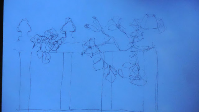
The drawing blue from the shade, capturing the basic composition.  The complexity of the plant made drawing the entire plant a waste of time.
I set up my easel in such a way that I was able to see my subject without being obstructed.  I am right handed so all of my pastels are on the ground to the right.  This just makes it easier to observe the subject.

At this point in the painting I am trying to build the composition by placing the of the basic shapes.  The fence boards are really helpful in deciding where the placement of the foliage should be.
At this stage of the painting, I am trying to elaborate and define the shapes and the values of the foliage.

The road map for the painting has been laid down.  At this point corrections are minor.  Sticking to the initial plan well into the painting simplifies the ending.  It becomes a extension of the initial thoughts which arrives at a simple conclusion.  No last minute drama.
The finished painting.  Note how blue the painting is in the shade.


The value shot.
The finished painting photographed in the sunlight.
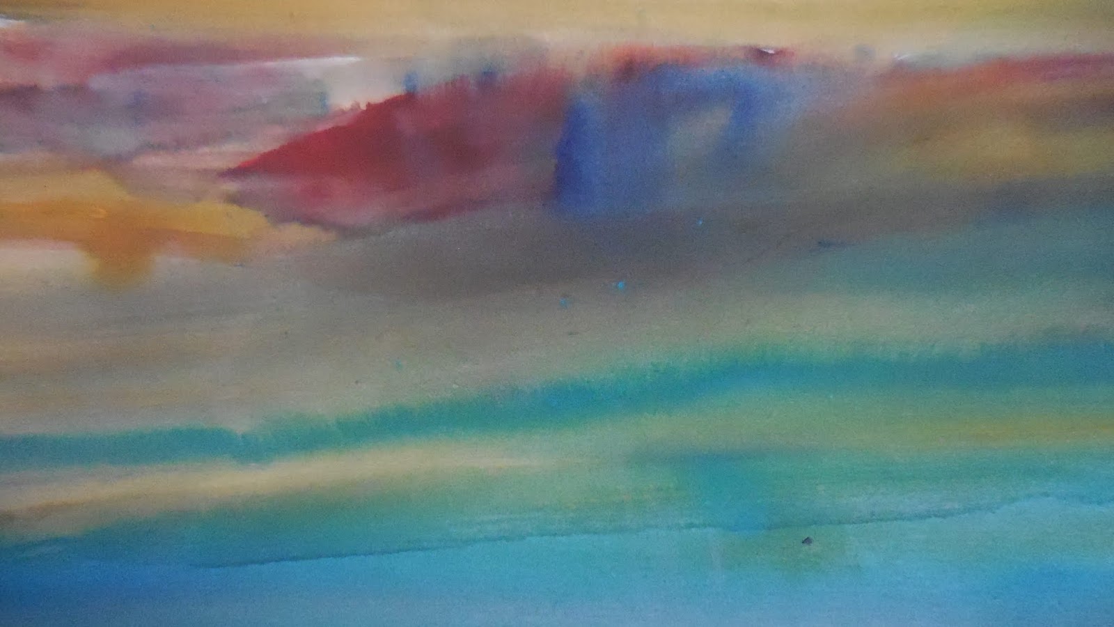
The detail shot.
The detail shot.

Thursday, February 13, 2020

Back Bay

This painting is a mixed media painting that was completed by using watercolor, graphite, and pastel.  The painting measures 27" X 41".
The under painting of watercolor allows me to quickly cover the entire surface and establish the basic values and composition.
The muddy under painting will allow for a gradual build up of shapes and color.

The under painting is completed.
The sanded paper I used for this painting is ideal for mixed media.  The paper is able to hold water color and maintain a tooth that supports layers of pastel or graphite.
At this stage I am elaborating on the shapes created by the watercolor under painting with graphite sticks.
The graphite sticks in red, blue, green, and gray really helped establish the contours of the marsh in the foreground.
STAGE 1 This is the under painting completed.
STAGE 2 This is the painting after the application of graphite.
STAGE 3 This is the phase where the pastel is being applied.


The finished painting.  Back Bay
The value shot.  It looks like I captured the moody day correctly.
The detail shot.

Tuesday, February 11, 2020

Wednesday, February 5, 2020

Salt Creek

Salt Creek mixed media painting with a water color under painting and pastel.  This painting measures 27" X 40".

The overall idea captured quickly with a loose under painting.
The painting is composed of a number of abstract and harmonious pieces that when connected lend context to the attempt to represent a certain level of reality.
The flow created by the water color is the binding element within the painting.
When seen in this limited context the abstract nature becomes apparent.
I know this will become a rock.  At least I hope it will become a rock later in the painting.  At this point this is the starting point of what this rock could be.  The idea of shape, color, and value begin to take place.
The water color acts as the sounding board to the application of pastel.  The overall gray nature of the under painting sets up the potential for dynamic color interaction.
When laying down the water color, I am generally thinking about creating opportunities for the application of complimentary colors.  I bounce back and forth between laying down local color in the under painting and laying down a complimentary color to the object in the painting.  
Some areas are left with a very thin layer of water color to let the pastel dominate.
The painting gets worked over the entire surface repeatedly.  I am trying to build color harmony within the areas of the painting.


As you pull back to see the entire painting, the abstract elements are joined in such a way as to create the a semi realistic representation.
The tighter the shot, the more abstract the selected part of the painting appears to be.
As the shot pulls progressively back, the context becomes revealed and the painting becomes less abstract.


These shots of the crashing wave illustrates the same idea.


The value shot.  Did I get enough value separation between the lightest light and the darkest dark.                         
The finished painting

The detail shot.