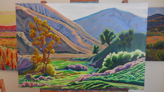
In this painting, I wanted to establish the atmospheric perspective at the beginning.
Normally I would establish the darker colors first and then work semi-progressively towards the lighter colors.
The main shapes are in place. There is room within the shapes for the values to get darker or lighter. You can see how glossy the surface is from the saffron oil.
Working to get the shapes and the values of the shapes adjusted.
Adding the smaller shapes within the composition and balancing them to the other shapes in the painting.
It is critical at this juncture to not disrupt to proceed too quickly. The accuracy of the shapes and the placement of them must keep evolving in relation to each other to make the composition believable.
I now have 28 colors in my pallet. I am not sure how I would characterize my pigment choices. You could call it a split compliment or prismatic pallet. My most recent additions are transparent orange and brown pink. I know a lot of painters talk about keeping their pigment variety simple so that they can master their paint mixing. I really enjoy the mystery of the possibilities. The discoveries made are not slavishly committed to memory. What is the benefit to dialing in your four color pallet if all of the colors you can make with it are dull and uninspiring? I believe in complexity. I like the idea of having a lot of different paths to finding a color.
As the painting progresses, I am using additional colors and values to redefine the shapes and add progressively smaller and less critical shapes.
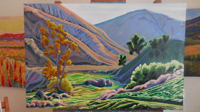
Refocusing on the atmospheric perspective by making the shapes in the foreground darker and the background lighter. Balancing all of the values between to insure a natural flow.
Creating larger contrasts in value in the foreground will make the background push itself back further.
Developing subtle changes within the shapes and adding smaller and smaller divisions within the painting.
Now some of the highlights come into play. Trying to push myself to push the value dynamics. How far can I push the contrast between the lightest lights and the darkest darks?
Bringing the middle ground into balance with shape differentiation, color variance, and value.
Final value adjustments.
Final details being added and refined.
 |
Is it done?
|
 |
The value shot.
|


