 |
| From time to time I go back and photograph my paintings in my studio. I do this so that I have a better photograph of my work. Most of my photos are done in the field. As such, the lighting and the cropping are not the best. Here are some of my more recent paintings with a better controlled photo. |

Wednesday, March 5, 2014
Repeat Posting




Tuesday, March 4, 2014
Corona Hills
 |
The scope of the distance covered in this composition made it difficult to fit into this 24"X 36" panel. In order to create an impressionistic feeling, I am working at alternating complementary colors. I started with a blue panel and worked some warm browns and some oranges. I then worked greens with some reds and violets over the first layer of painting.
|


Corona Hills
 |

Corona Hills
 |
This painting was not as satisfying as many of my paintings. I struggled with the composition, the colors, the feeling, and the space management. In the end, instead of putting the frosting on the cake, I fought to get the painting out of the oven. It took everything I had to pull it back from a total disaster.
|
Monday, March 3, 2014

Into The Was
 |
| This is a studio painting in pastel. It measures 24"X 36". The location for this painting was just off of Black Star Canyon Road in Santiago Canyon. |
Sunday, March 2, 2014
Shaws Cove
 |
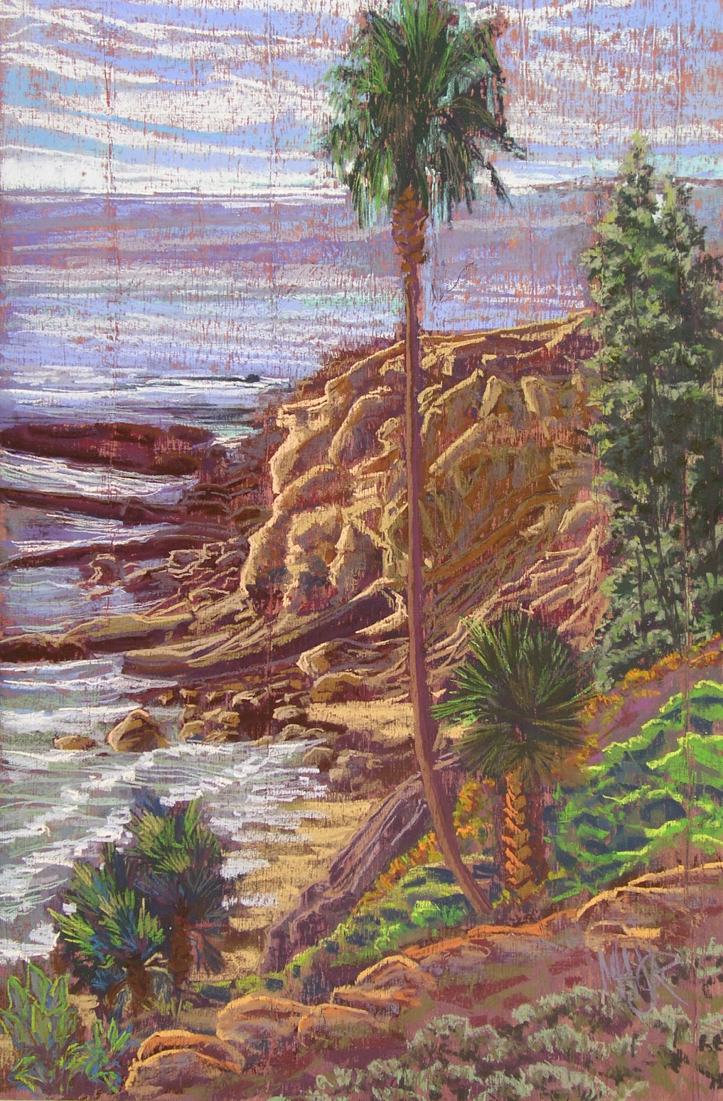
The day after I painted at Crescent Bay, I painted at Shaws Cove. Shaws Cove is the next beach south from Crescent Bay. When the tide is low enough you can walk around the rocks below the bluffs from one beach to the other. From those rocks there have been several classic plein air paintings by the masters. I will paint from those rocks but not this day. I was afraid of getting stuck with all of my gear while the tide was coming in.
|


Shaws Cove
 |
Do the parts relate to the whole? Is the whole a seamless expression through mood?
|


If the values are right then the color choices become more believable. When I look at my paintings days after I have painted them, I often think wow how did I see it like that. When I am painting them I am not thinking about if my color choices are right or wrong. It is automatic; I am of no mind.
Shaws Cove
 |
The sun was brilliant and in my face as I painted alone on this amazing beach. The constant sound of the waves running onto the shore. The unusual warmth at this time of year. The heat of the sun in the sand on my feet. The shadows shifting slowly but constantly changing the view. Beautiful colors changing with the day. The deep feeling of calm and peace to the exclusion of everything but me, the painting, and the beauty around me.
|
Canyon Shadows
 |
This painting measures 18"X 30". This pastel painting is on sanded paper and started with a water color under painting. The reference photos were taken from the back yard of a home that burnt down during the Chino Hills fire a couple of years ago. In the past year I have been searching out locations like this because of their view. This fire caused a evacuation of our neighborhood. The fire got a couple of hundred yards away. I remember staying back at the house, keeping it wet with the garden hose, and watching out for some of the neighbors. Although it has been about four years, some of the 20 odd houses that had burned down have not been replaced. The views from these back yards are amazing and would not be possible if not for their misfortune.
|
Tuesday, February 25, 2014
Crescent Bay
 |
| This is one of my favorite places. I used to come to this beach all of the time. I love the beauty and the memories of this beach. It is a small and secluded beach. It has tidal rocks and bluffs on both ends. This keeps if fairly quiet. The weather was amazing. It was about 75 and sunny at the beach. It is tough work. |
 |
| I started with a sanded paper and put down a water color under painting. The composition is established but there is some room to change some aspects of it because the pastels still have to go onto it. |
 |
| At this point I am laying in the pastel. I wanted the under painting to be dark enough so that the pastels would be the highlights. I was also trying to create the painting in shades of gray so the pigment would be vibrant against the back drop of the under painting. |
Crescent Bay
 |
| I started with the bluffs because that was the main subject and the details of them were going to require the most time. |
 |
| Although I am trying to cover the surface with pastel, I stopped to focus on the details in the bluffs so that I could capture the lighting on their face. At this time the sun was about to put them in shadow and I had to decide what features I wanted them to have. |
 |
| Done except for the final adjustments. At some point the painting is what it is and you can't go back to fix or change it because of all of the work you would have to put into it. Learn your lessons and move on. |
Crescent Bay
 |
| In looking at this painting from a distance it seems like I took the easy composition. In looking at a number of my paintings, it seems like I have the same shapes in my main subjects. I am going to have to work harder to find better compositions going forward. This composition just seems too easy. The reason I took this picture is because someone said the painting really "popped" from distance. |
 |
| Some of the challenges for this painting held it back from being better. The next time I paint this beach, I will make the painting more about the whole experience not just the bluffs. Usually I am looking for more color than is actually in the painting, but I think I should work down into some more subtle color relationships. |
 |
| As I finished up, this is how the bluffs looked. I really liked the grays within the bluffs. This will be the subject of a studio painting in the future. |
Crescent Bay
 |
| By the time I finished in the middle of the afternoon, everything had changed. The sun moving across the front of the bluffs had reached a point where everything was in shadow except the beach. I had to rely on my memory of the scene to complete the painting. This is a pastel painting that is painted over a watercolor under painting. The painting measures 24"X 36". |
Sunday, February 23, 2014
Cloud Shadows
 |
| I have started working on a series of paintings with the sky as the main subject. This is the second painting in the series. The light and contrast in the clouds versus the subdued field with it's saturated colors caught my attention. This pastel painting started out with a watercolor under painting. The hills started out in deep complimentary colors. When I am doing an under painting, I am thinking in terms of what I will paint over it and the reaction between the two. I am also trying to establish the darkest areas within each area of the painting. Because pastels are so vibrant, using over the under painting creates a more dramatic and fresh feeling. |
Sunday, February 16, 2014
Haze Into the Hills
 |
| The light was filtered through the afternoon haze. The highlights of the light upon the trees fading into the distance up the canyon was what I found interesting in this subject. |
 |
| Each painting is different and each painting has a different approach needed to maintain the thought behind the painting. The rim light running along the trees and the hills had to remain intact. It was the lightest light. Normally the lightest light is the last thing added. |
 |
| The shapes of the hills and their scale was important to the composition. In order to create some sense of size and distance the trees in the middle ground were placed as a counter point to the highlights moving up the canyon. |
Haze Into the Hills
 |
| A focus on the warmth and coolness of the masses was needed to build the feeling of the hills receding into the distance. To maintain the feeling the haze created I did not create big differences in the values between the hills. |


Haze Into the Hills


Subscribe to:
Posts (Atom)