Pinterest

Follow Me on Pinterest
Showing posts with label Landscape Painting. Show all posts

Sunday, January 14, 2018

Mixed Media Approach to Poplar Trees in Irvine Park

I like to work on sanded paper for mixed media approaches to landscape painting when working with water color and pastel.  The paper really holds up to the water and it really accentuates the pastel.
Here you can see the reference photo I took in Irvine Park in the early fall.
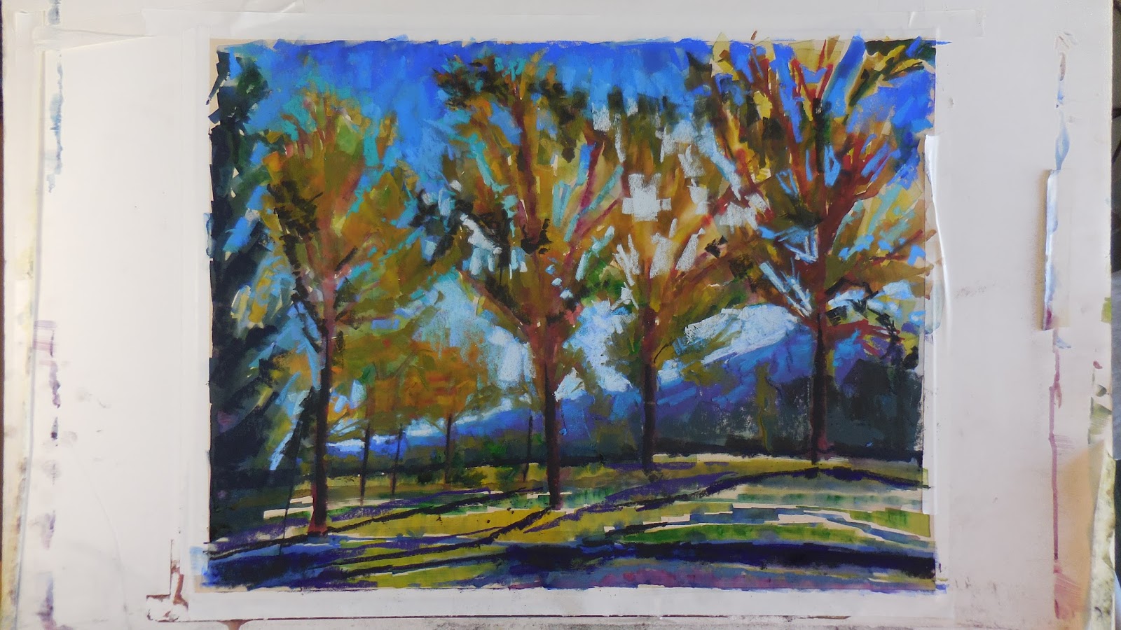
In this painting I have tried to keep the colors and shapes separate so I can have a clear idea of the accuracy of the shapes.
This painting was built up layer after layer.  There were multiple sessions where I put down water color.  The values were not as important here beyond establishing a comparison from dark to light.
This painting took longer to get the values where I wanted them because I was afraid to make a mistake.  This subject was important to me and it was important to not waste my time by failing.
A neat pallet in my mixed media paintings is not a priority for me.  The under painting is the base which I build upon.  It is something to interact with and to react to.  Using complimentary colors to create grays in the under painting helps support the vibrancy in the final stages of the painting.
While building this painting, I am constantly thinking about what I am doing with water color and how I will bring out the final colors and values.
The darker and grayer I can get in the under painting, the more striking the final painting will be.
The abstract nature of the parts of the painting are brought into context when they are assembled fully.
I like the complexity of shapes and color.  They create an implied detail without the restraint of slavishly trying to recreate the exact scene.
The water color under painting allows me to explore shapes and color without the risk I will take in the later stages of the painting.  Any mistake can be painted over with little or no effort.
As I became more confident in the shapes, value, and color in the under painting, I did not rely on the separation of shapes as much.
There is no intent to create abstract shapes within the painting.  They exist in the painting because of the freedom and confidence in my expression.  Control at the cost of expression is not worth the effort. 
These paintings are as much about my feelings for them as they are about the place I am painting.  

At the end of this part of the painting I felt the need to make sure the entire surface was covered to some degree of paint.
As I start the application of pastel, I am focused on defining the shapes more completely.  It is like a repeat of the process with the water color under painting.  There is less freedom in expression.
The adjustment of values continues till the end of the painting.  The beauty of pastel is that because it is a dry application, values can be worked in all directions not just from dark to light.  
Here I have continued to create greater definition of shape, depth of value, and deeper vibrancy of the color.
When the start of the painting has been really established according to the initial goals and thoughts, the later stages seem to be a logical progression till the end.
It is important to keep the final highlights off the painting till the very end.  Otherwise the painting looses its freshness and looks overworked. 
One of the biggest challenges in this painting was to describe the brightness of the sun behind the leaves of the poplar trees.
I really enjoy the complexity of color and diversity of mark making that you can achieve through this technique.
The smooth washes of water color contrasted with the drawing and mark making of pastel create a dynamic and balance within the painting.
One of the trends in my recent painting efforts revolves around the idea of addition vs. subtraction.  When working with water color and pastel, there is this give and take between the two.  You first give with the water color.  By adding pastel over the water color you are adding to the painting but you at the same time are subtracting or covering up something you have already put down.  Addition by subtraction.
At the same time you are adding and subtracting you are creating this dynamic interaction between the mediums.  While this is all going on is my impressionistic approach to color.
The shapes are in place, the colors and values are locked in for the most part.  The focus is the finish.
The lightest values and colors still need to be added.  The other focus is the edges of the shapes.

Does it feel like I intend it?  At this point it is too late if it doesn't.  The question is asked throughout the painting from start to finish.  Because painting is a construction process you have to have the confidence in your basics so that your instincts are allowed to run free.  To me, it is that freedom that allows your true style to be expressed.
Through my devotion to plein air painting, I am better able to take advantage of painting from reference photos.  One of the advantages of working from photos is that the camera can catch some lighting effects that are hard to visualize while painting.  For example the red in the foliage of the Poplar trees.  I would have to squint like crazy to study that part of the composition.  I would probably come up with something quite different on site.

The last question to be answered.  When is enough-enough?
The finished painting.
The value shot.
The detail shot.

Wednesday, November 29, 2017

Chino Hills Morning

Chino Hills  Morning 30"X 48" oil on canvas done in the studio.  This painting was inspired by a hike in the Chino Hills State Park.  I really like the light this time of year in the park.  The shadows in between the hills were of particular interest to me.  I like to paint larger because it affords me a greater opportunity to explore color.  
In this value shot I was particularly interested in the separation of the foreground from the background.  There is no middle ground in the painting.  Although the shadows were my primary interest, I had to make sure that there was the right amount of aerial perspective.  Aerial perspective at times has been a challenge.  The strength of the shadows was important to me.  They were large and strong when I saw them.  They were not very far from my vista.  However, I had to make them believable.  In past paintings the issue was more about the foreground not being strong enough.  In my recent efforts, my intention has been to push the lights lighter and the darks darker to arrive at the illusion of distance.  
The detail shot.  This large painting allowed me to express myself through my mark making to a greater degree.  This painting represents my attempt to push my skill further.  

Warm Waters Morning


Warm Waters Morning 24x36 oil on canvas in the studio.
A really simple beginning.  I started with a thin wash of paint.  In the past I have used thinners to get the initial shapes down.  I them moved to walnut oil.  Now I am using Safflower oil because it is more compatible with the oil in the paint that I am using.  
On the easel.  Checking the look of the overall composition from distance.  In this painting it was fairly easy to maintain the initial notan.
In this shot you can see the thin wash and brush strokes in what will be the water in the foreground.
With all of the shapes defined with different values, I began to add the color.
This painting had a very deliberate and simple color progression.  The slower buildup allowed for more subtlety within the painting.
The big finish.  Everything was set up for a quick and dynamic ending.
The finished painting.

The value shot.

The detail shot.  Time to evaluate the brush work and the abstract nature within the painting.