Pinterest

Follow Me on Pinterest

Monday, February 8, 2021

The Hills Coming Back


The Hills Coming Back 24x36 inches soft pastel on board.

This great view was only possible because of the tragic loss created by the wild fire in Chino Hills.
I made the board earlier that day.  I always look at the sky before I make the board and think about the color of light where I am planning on painting.  The board is 3/16 " good two side plywood with a pumice gel and acrylic paint solution brushed over the surface.
The initial drawing was challenging because of the amount of information I wanted to include in the painting.  The size and the shape of the board limited the panoramic nature of the composition.
At this stage of the painting, I have focused on the elaboration of the colors, values, and the details of the shapes.  In this painting I then decided to try and complete one area of the painting at a time.
I wanted to complete the foreground first to establish the darkest values so that I could better judge the atmospheric perspective within the painting.
I moved from the foreground to the background to establish the counter point in values within the painting.  I completed the painting in the middle ground.  This was a new approach for me.  I am not sure how much better the end result is but it is nice to be flexible in my approach and problem solving processes.
I like to include these small sections of my paintings to allow the viewer the opportunity to explore the painting further.
These "micro compositions" are like the puzzles pieces.  When viewed by themselves they show the diversity of color, mark making, and shapes that contribute to the overall gestalt of the painting.
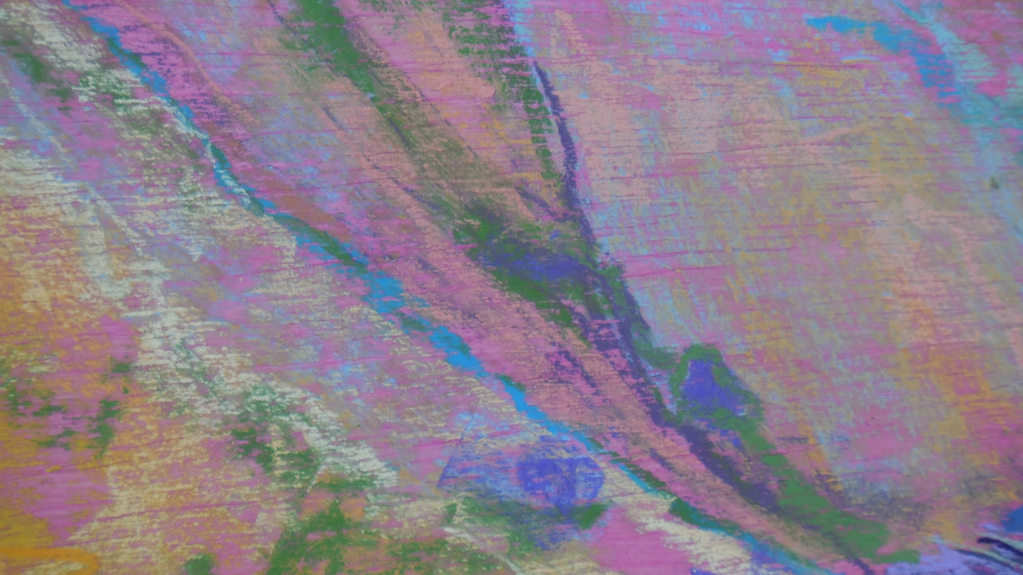
Some areas in the painting have passages that emphasize color harmony and subtle transitions.
The interplay between mark making and scrumbling.
Contextual abstraction within the painting.
The amount of detail within small areas can be considerable.  Does it overwhelm the composition or does it further the objectives?
In this section as well as the others you can see the importance of the color of the board.  It is the first color which helps determine every subsequent color.  It also creates a level of color unity.  The underpainting conveys the idea of notan.  It is not just what you put down on the surface but also what you do not put down.  
I like the diversity of complimentary colors in this painting.  How many mini abstract paintings are held within the overall painting.
The finished painting on site.  The sun at my back and directly on the painting surface.  One of the advantages of painting with pastel is the complete lack of glare on the surface.
 

The Hills Coming Back finished.
The value shot.  The sun drenched hills seemed to flatten out the value scale.

The detail shot allows for a deeper exploration of color, detail, texture, micro compositions, and the relationships between all of them.

Tuesday, January 26, 2021

Off The Wall


These paintings have been hanging on the wall for years.  They represent my ability at the time they were painted.  They also represent a challenge to my ability.  At some point during the painting I realized I was unable to finish the painting and achieve the results I wanted.  They are unsolved problems.


I remember the excitement when I started this painting.  I really liked the fronds in the palm trees and the faded stain of warm colors.  I was not sure how I could push this one to the finish and achieve the effects I was after.  The light in this scene was amazing.  I did not know how to achieve the lighting effects.

I started over.  I painted over the entire surface trying to stay true to the colors.  The palm trees would have to be added later.
I made sure to push the contrast in values in the sky as far as I was able.  I also tried to nail the color without losing the transition in values within the sky.
Another challenge was trying to create the glare from the setting sun as it fell upon the land.  I had to just trust what I saw and how I would be able to paint it.  I did not need a lack of confidence impacting my painting.
I worked and reworked the light and clouds to have smooth flowing transitions.  Although there were many colors running into each other I wanted there to be a feeling of harmony.
I worked to not get caught up in too much detail and not to disrupt the elements within the painting


The value test.  When you are putting the color down, the values can get lost.  This painting presented a challenge in this respect.  The clouds and the transition in values in them was of special concern to me.


Monday, January 4, 2021

Light Pepper

Light Pepper  This painting was inspired by the dramatic lighting I found while walking around a dried lake bed near my home.  In addition to the light filtering through the Pepper tree onto the path, I was really drawn to the intense intricacy of the Pepper tree branches. 
The painting started as a quick watercolor under painting.  I tried to capture a quick indication of shape, light color, and ideas about the branches.
In this detail shot I am trying to show the difference in the filtered light coming through the branches and the light upon the path.  The light coming through the tree is cool and the light on the path is warm.

The shifting values of the filtered light were indicated by changing the color and intensity of the pastel marks.  Changing the pressure from hard to soft helped create the gradual differences in value and helped create the illusion of detail in the branches in the Pepper tree.
Here are the early indicators of color and value as I laid down my first layer of pastel.
This detail shot really sums up the interactions between color, value, texture, and the interplay between the pastel and the water color.  A lot of my current ideas about interchange are captured in this shot.
 
Trying to stay patient and to stay on track. Sometimes the excitement of the moment gets in the way of the process.  Having the vision of what the finished painting will look like can lead to a premature finish.
I chose this detail shot to indicate the variety of mark making within the painting.

This detail shot was included to show the condition of the surface before the final details were added.

A detail shot with an indication of scale.


The value shot looks like a good pencil drawing.  I consider that a strong indicator of the success of a painting.

The finished painting "Light Pepper".  


Wednesday, December 9, 2020

The Coming Storm

The Coming Storm mixed media watercolor under painting with pastel on sanded paper.  47 x 30  Placed within a room on a app to help envision what it would look like hanging.
The finished painting.
Here I am softening the edges of the shapes and blending the colors to more accurately represent the shapes and values of the clouds.
Adjusting shapes and values to more closely represent my subject.
The first application of pastel intended to push the composition further along by fleshing out the shapes and values.  The application of color at this point was intended to further the development of the under painting.
The underpainting completed and ready for pastel.
I softened the shapes of the clouds with a wash of water to give the clouds a more flowing feel.
Working my way up from the bottom of the painting pulling all of the shapes together by softening and blending the shapes within the painting with washes.
The shapes of the trees at the bottom of the painting anchor the composition and finishes the outline of the spatial relationships. 
Abstract shapes become realistic as the context of the composition develops.
I used a 2 inch brush for the entire under painting.  I like using a larger brush to establish shapes within the under painting.  Using a single brush makes you change the way you apply paint.
Focusing on the quality of the individual shapes while fitting them into the context of the composition.
Here the overall map to the composition has been established.  My thought process was to get the shapes and values right the first time.  I envisioned a calligraphic approach to the application of watercolor. 
Starting with watercolor.  Establishing shapes and values as a guide to follow later with the application of pastels.