


 |
I got a late start and wanted to paint by the house without having to hike all over the place. I found this neighborhood where the street was blocked off by this gate. So I walked to the end of the street and started to paint. I liked painting in the middle of the street.
|
 |
The clouds were flying over the hills off into the distance constantly changing everything. The hills seemed to melt into each other. The light was at my back and slowly lowering itself and changing the shadows by the minute.
|
 |
This board is about 24"X36" and is made with fine pumice gel and Smalt hue acrylic paint. The Smalt hue is very transparent so the color of the board influences the painting more than when I am using opaque colors.
|
 |
In addition to developing the shapes, colors, and values in the foreground; I also attempted to create the feeling of distance and grab the shapes of the clouds before they changed.
|
 |
The amount of detail in all of the hills in the background was immense. My focus was not on how I was going to get it done in the amount of time I had. I just kept subdividing the space relative to the shapes within the shapes that I created while trying to capture the color and values.
|
 |
If I had done a better job at getting the shapes of the hills more accurate it would have made it easier to get to the relationship between them in the distance.
|


 |
As the basic elements of the background were put in I moved to the middle and foreground. Because the painting was almost entirely different gray colors I wanted to make sure that I captured the differences in value while maintaining the light key. This is an important part of any painting but for some reason it is not something I conscious about.
|
 |
I had to decide what how dark I would make the middle ground and the foreground in relation to the background so that the distance would seem believable. I also focused on the how light and blue the grays I used to help define the distance and maintaining the overcast feeling.
|

 |
As I was getting close to the finish the light began to change. The clouds started to burn off and the light fell upon the rocks changing everything. I started changing the rocks and chasing the colors of the light as it fell upon the ground.
|
 |
It was at this point that I had to remember how I wanted the painting to turn out and what the colors had to be if it was going to work. I grayed down the rocks and maintained the colors and values in the painting.
|
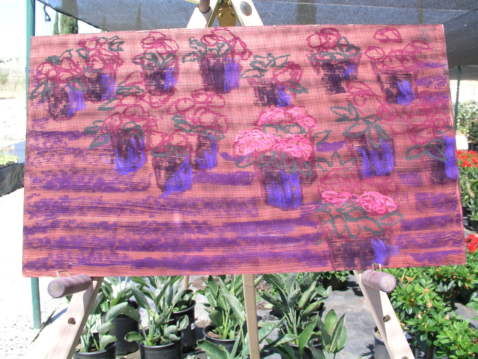 |
I wanted to show the multiple pots and the shadows created by them. This however limited the detail and the diversity of the color. If I were to take this painting as a reference for a studio work I would either make the painting larger or reduce the number of pots so I could focus more on the flowers and the foliage.
|
 |
Because the light was filtered through the shade cloth I did not have the full range of values. The colors were more saturated. The way I approached the colors and the values had to be slightly different.
|
 |
As I was painting under the shade cloth I had to keep checking the surface for the shadows created by it. The shadows were on the plastic beneath the plants but I had to be sure that I was creating the shadows on the painting and that they were not the actual shadows.
|
 |
One of the continuing challenges with painting smaller is the resolution of the subjects within the composition. The impressionistic strokes seem to make the painting less substantive.
|
 |
This was the first time I had painted in a nursery so I wanted to make sure I had a painting showing the flowers and plants. In the previous painting I really didn't do that. The challenge was the amount of detail in the subject. Most of the time I am specific about the composition, but in this painting I generalized the shape through color and then sought to add color notes to suggest the details of the composition.
|
 |
The end result is not typical of my paintings. There is a lot less detail.
|
 |
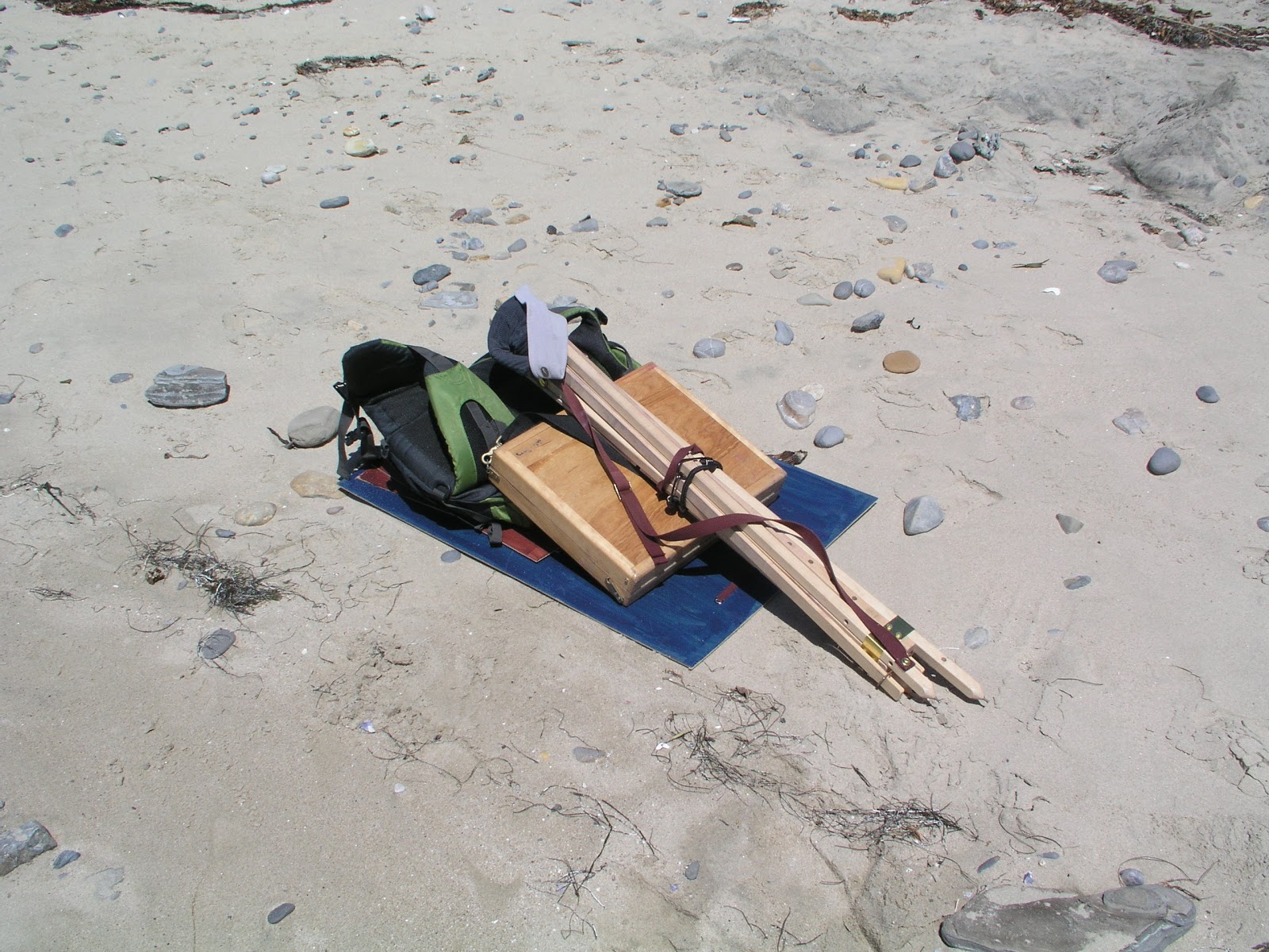
Because of the weight of my gear I am picking locations that provide multiple views. The location where I was painting from could have provided the material for hundreds of paintings. As I prepare for a trip in the Cascades I thinking about how I will change my set up so that I am able to go further into the wilderness and how I will be able to transport multiple finished paintings. When I had completed my day of painting at around 4pm I had to stop about 15 times because of the burn in my hands from carrying my pastels back to the car.
|
 |
I took a different approach in this painting. There was less drawing and more painting and layering of colors in this painting.
|

 |
I picked up a cool red / purple to create a different feeling in the shadows and the details of the painting. It was intended to help create the feeling of atmospheric perspective.
|
 |
At this point in the painting I felt like I had to create a feeling of separation between the bluffs in the foreground, the middle ground, and the background.
|
 |
This painting is much simpler than my first painting of the day. Because of the size of the painting and the speed with which I paint I had to be careful to not overwork that painting.
|
 |
It was a good day of painting. As I left for the car I regretted the difficulty of packing my stuff up and getting it back to the car. I felt like the best painting of the day would have been the next one. The one I didn't get to paint.
|
 |
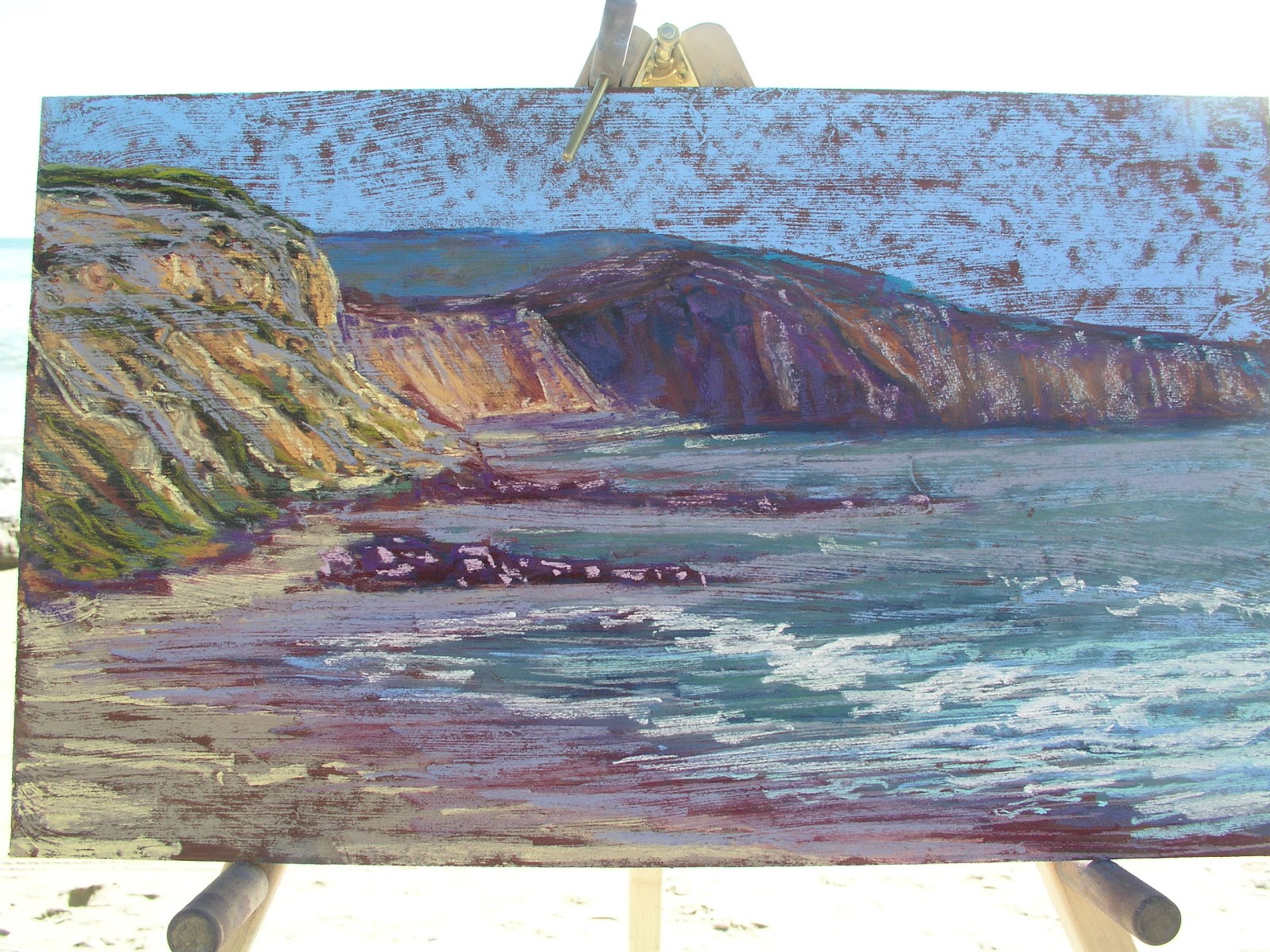
Painting at low tide in Crystal Cove at Pelican Point. The clouds had burned off just as I got to the beach. I carried down my 40 pounds of gear and took a bunch of reference photographs.
|
 |
I set up in a location that had at least two distinct subjects that I wanted to paint.
|

 |
The complexity of the point demands detail. If I leave out some elements or reduce their detail I am not telling the story of how amazing this place is. The rocks in the water and the waves pulling out.
|


 |
I continued laying in the contour of the rocks in middle values carrying them into the rocks in the water. I worked at getting the detail of the water balanced with the shape of the waves and the color of the water.
|
 |


